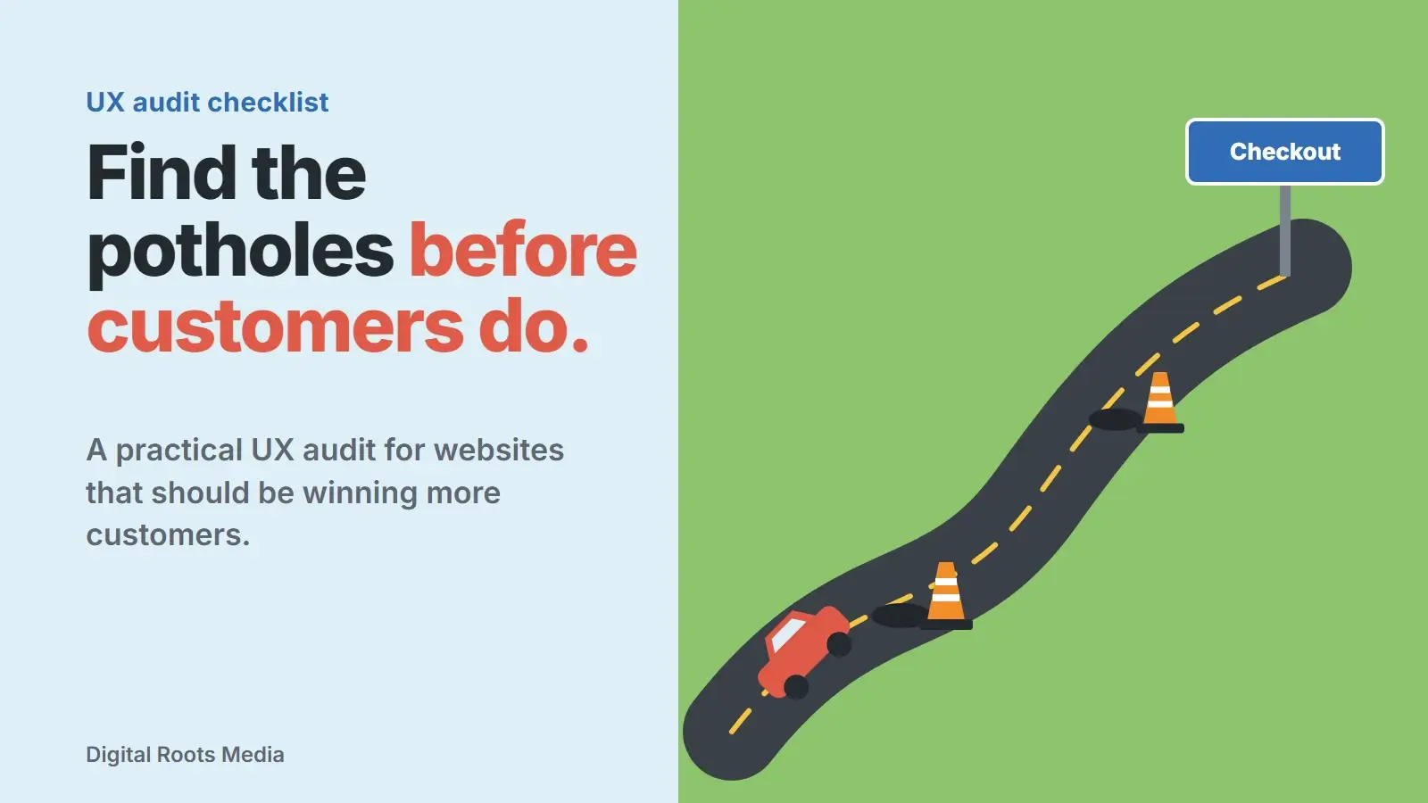
A UX audit checklist is a structured list of checks that shows where a website makes it hard for people to do what they came to do: find information, trust you, and get in touch or buy. A good UX audit combines three things: data on where visitors drop off, recordings and tests that show why, and an expert review against established usability principles. The output is a prioritized list of fixes, starting with the quick wins.
This guide gives you a practical checklist you can run on your own site, organized as six stops along the customer’s route. It uses the well-known 10 usability heuristics from Nielsen Norman Group and the accessibility standard WCAG 2.2 as the yardsticks, so every finding is measured against something more solid than opinion.
- Start with data: find the pages and steps where visitors leave.
- Watch real behaviour with heatmaps, recordings and a few user tests.
- Review each key page against Nielsen’s 10 usability heuristics.
- Check mobile, speed and accessibility, including tap targets of at least 24 by 24 CSS pixels.
- Sort every finding by impact and effort, and fix the quick wins first.
What is a UX audit?
A UX audit is a review of a website or app from the user’s point of view. It asks a simple question about every important journey: where do people get stuck, confused or put off? Unlike a design critique, it is grounded in evidence: analytics, behaviour data, user testing and established usability principles.
Most businesses benefit from one when conversions stall, before a redesign, after a big change to the site, or when the bounce rate on key pages is stubbornly high. It is also the fastest way to decide what a redesign should actually fix.
Before you start: gather the evidence
An audit without data is a list of opinions. Before reviewing a single page, collect three kinds of evidence:
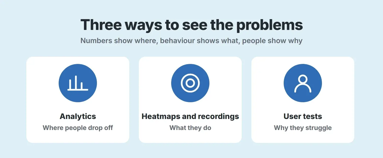
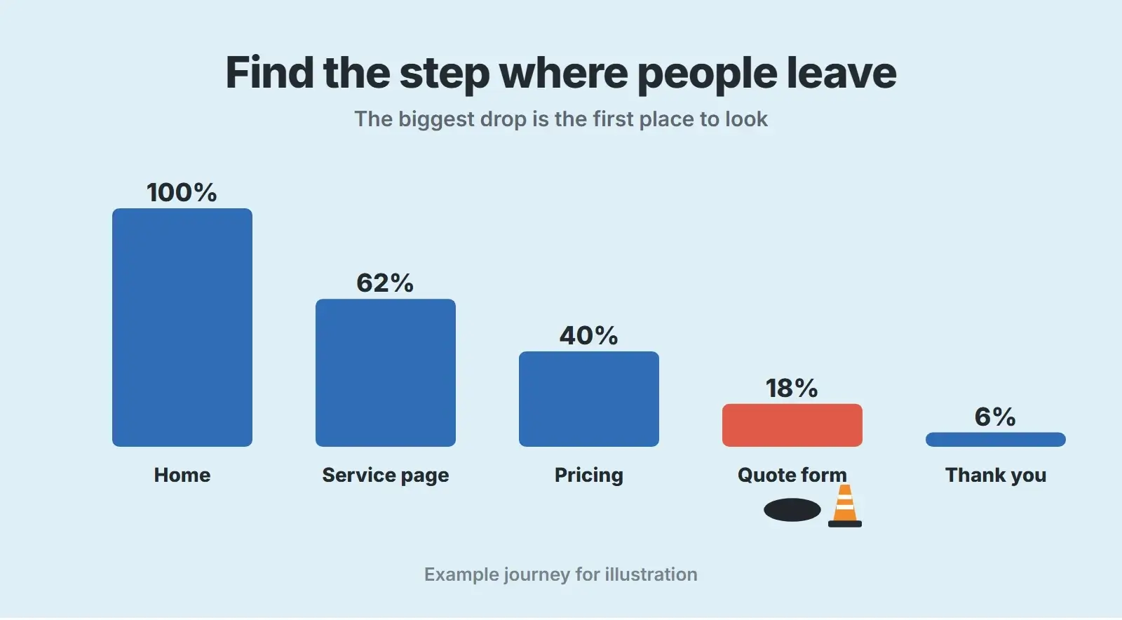
- Analytics: your top landing pages, the steps of your main conversion journey and where visitors leave. Segment by device, because mobile and desktop often behave very differently.
- Heatmaps and recordings: where people click, how far they scroll and where they hesitate. Our guide to heatmaps and session recordings explains what to look for.
- User tests: ask five people who match your customers to complete a real task, such as requesting a quote, while thinking aloud. A handful of sessions usually reveals the biggest problems.
The six stops on a UX audit
Work through the site in the order a customer meets it. These are the six stops, and the checklist below covers each one.
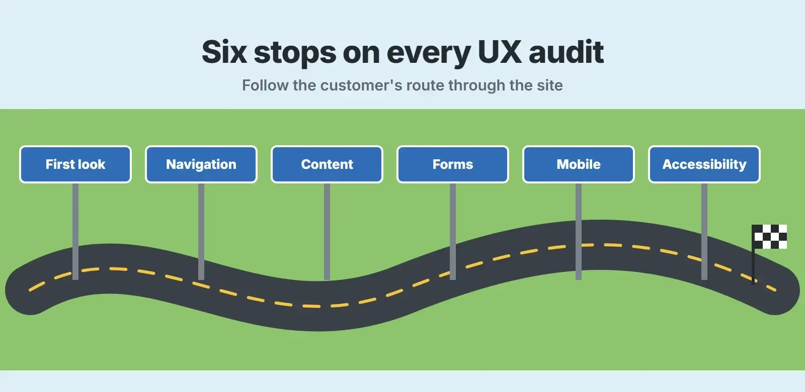
1. First look: the first five seconds
- Is it obvious within seconds what you do, who it is for and where you work?
- Is there one clear main action above the fold, such as a quote or call button?
- Do trust signals appear early: real reviews, recognisable clients, credentials?
- Does the page load quickly enough not to lose people? Our post on why websites lose customers in five seconds covers this moment.
2. Navigation: can people find their way?
- Are menu labels the words customers use, not internal jargon?
- Can visitors reach any key page in two or three clicks?
- Is the current location clear, with breadcrumbs on deeper pages?
- Does site search work and return sensible results, if you have it?
3. Content: does the page answer the question?
- Does each key page answer the main question near the top?
- Are prices, timings or at least the factors behind them explained?
- Is the text scannable, with clear headings, short paragraphs and lists?
- Do images show real work, people and places, not generic stock?
4. Forms: is the last step easy?
- Does the form ask only for what you need to respond?
- Do fields have visible labels, not just placeholder text that disappears?
- Are errors explained in plain words next to the field, without clearing what was typed?
- Is there a clear confirmation of what happens next after submitting?
5. Mobile: does it work on a phone?
- Is the main action easy to reach with a thumb on a small screen?
- Is text readable without zooming, and is there no sideways scrolling?
- Do taps respond quickly? Slow responses are measured by Interaction to Next Paint, which our INP guide explains.
- Do pop-ups and cookie banners leave the content usable?
6. Accessibility: can everyone use it?
- Can every part of the site be used with a keyboard alone, with a visible focus outline?
- Is text contrast sufficient, and do images have meaningful alt text?
- Are buttons and links big enough to hit reliably?
- Does the site meet WCAG 2.2 Level AA? Our WCAG 2.2 guide covers the standard.
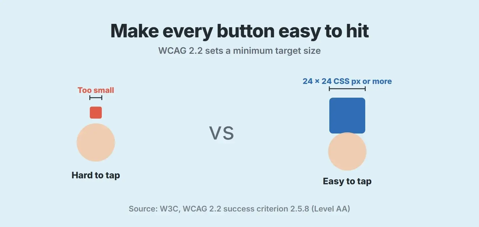
The W3C’s Target Size (Minimum) criterion, at Level AA, asks for pointer targets of at least 24 by 24 CSS pixels, with exceptions such as links inside a sentence or targets that have enough space around them. Small, cramped buttons fail people on phones and anyone with less precise movement.
Review every key page against the 10 heuristics
Jakob Nielsen developed his usability heuristics with Rolf Molich in 1990 and refined them in 1994. They are still the most widely used yardstick for an expert review, because they describe problems people meet on any interface:
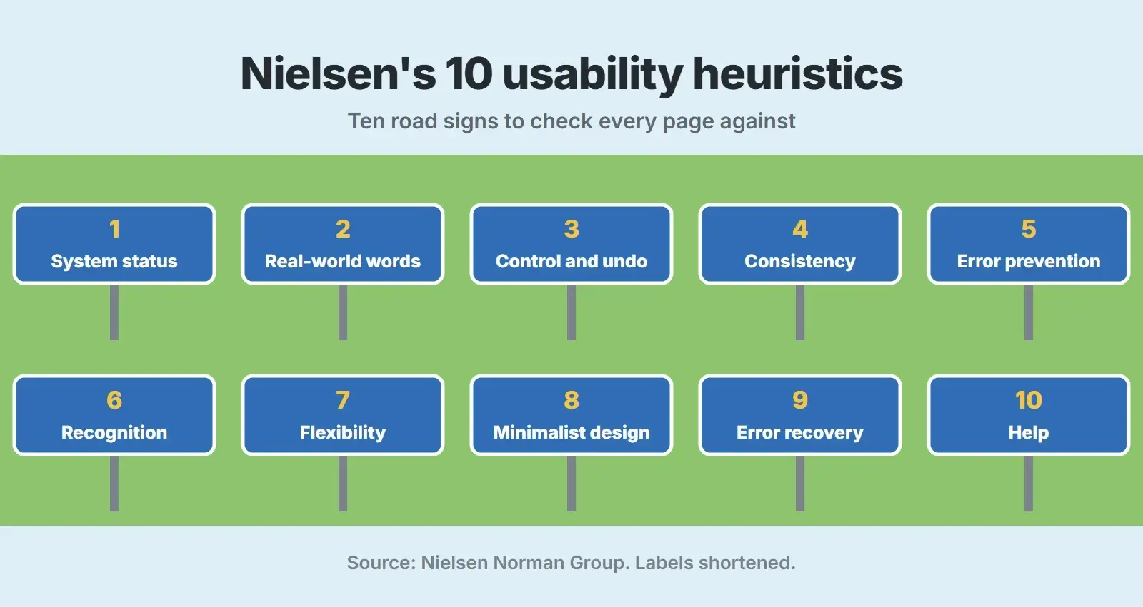
| Heuristic | What to check on a website |
|---|---|
| Visibility of system status | Buttons react when tapped; forms confirm submission; loading is shown |
| Match between the system and the real world | Labels and copy use the customer’s words |
| User control and freedom | Easy to go back, close pop-ups and change answers |
| Consistency and standards | Buttons, links and terms look and work the same everywhere |
| Error prevention | Clear formats, sensible defaults, confirmation before irreversible steps |
| Recognition rather than recall | Options visible; no need to remember details between pages |
| Flexibility and efficiency of use | Shortcuts for returning visitors, such as saved details |
| Aesthetic and minimalist design | No clutter competing with the main message and action |
| Help users recognize, diagnose and recover from errors | Plain-language error messages with a fix |
| Help and documentation | FAQs and help where questions naturally arise |
Prioritize the findings
An audit often produces dozens of findings. Trying to fix them all at once is how audits end up ignored. Score each finding for impact on the business and effort to fix, then sort:
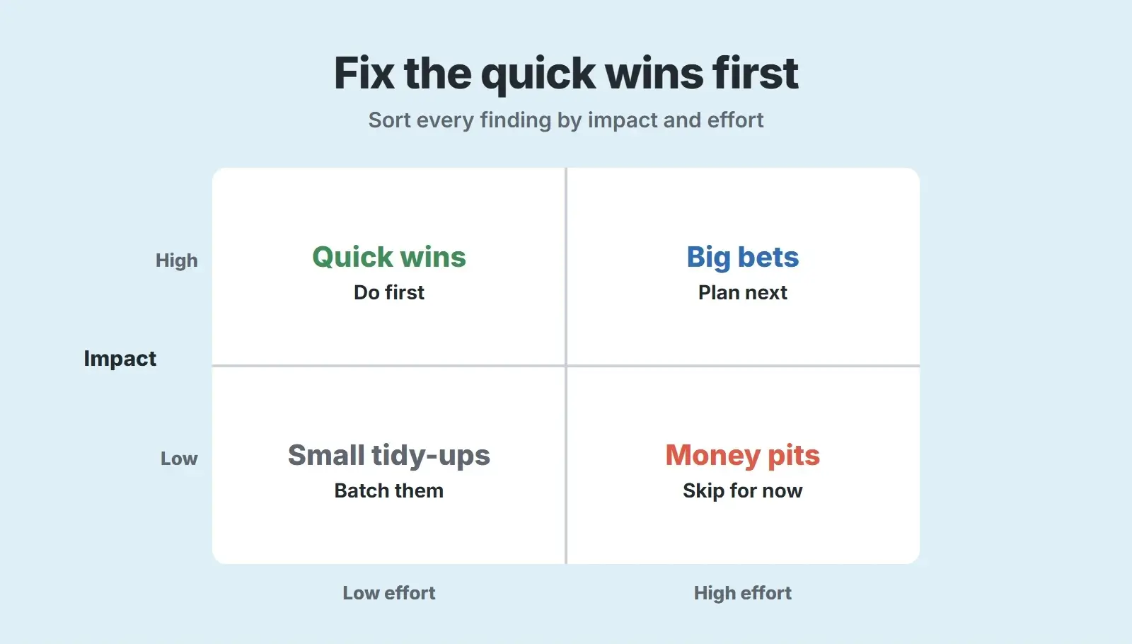
- Quick wins: high impact, low effort, such as clearer button text, a shorter form or a fixed mobile menu. Do these first.
- Big bets: high impact, high effort, such as restructuring navigation or rebuilding a key page. Plan them properly.
- Small tidy-ups: low impact, low effort. Batch them into routine work.
- Money pits: low impact, high effort. Skip them for now.
Where you are unsure whether a change will help, test it. Our A/B testing guide explains how to run simple tests, and our conversion rate optimization guide shows how UX fixes fit into a wider plan.
The UX audit checklist
- Pull analytics for top landing pages and every step of the main conversion journey, by device.
- Review heatmaps and at least 20 session recordings of the key pages.
- Run five short user tests on a real task, such as requesting a quote.
- Check the first five seconds: what you do, who for, one clear action, early trust signals.
- Check navigation labels, depth, breadcrumbs and search.
- Check content answers the main question near the top and shows real proof.
- Check forms for length, visible labels, helpful errors and a clear confirmation.
- Check mobile: thumb reach, readable text, fast taps and usable pop-ups.
- Check accessibility: keyboard use, focus, contrast, alt text and 24 by 24 pixel targets.
- Review key pages against Nielsen’s 10 heuristics.
- Score every finding by impact and effort, then fix quick wins first.
Landing pages deserve a closer look of their own, since they carry paid traffic. Our post on landing page elements has a focused checklist for them.
Want an expert UX audit of your website?
We combine your analytics, recordings and user tests with an expert review, then design and test the fixes so more visitors become customers.
Frequently asked questions
What is a UX audit?
A UX audit is a review of a website or app from the user’s point of view, using analytics, behaviour data, user testing and usability principles to find where people struggle. The result is a prioritized list of fixes that make it easier for visitors to find information, trust you and take action.
What should a UX audit checklist include?
Analytics and behaviour data first, then checks on the first impression, navigation, content, forms, mobile use and accessibility, a review against Nielsen’s 10 usability heuristics, and a final step that scores every finding by impact and effort so the most valuable fixes happen first.
How long does a UX audit take?
It depends on the size of the site and how many journeys you review. A focused audit of one main journey, such as a quote request, is a much smaller job than a full review of a large store. Starting with the journey that matters most to revenue keeps it manageable.
Can I do a UX audit myself?
Yes, for a first pass. Use this checklist, your analytics and a few recordings. An outside reviewer helps because you know your own site too well to see it like a new visitor. User tests with real customers are the most valuable part, and they are easy to run yourself.
What is the difference between a UX audit and a CRO audit?
They overlap. A UX audit focuses on how easy and pleasant the site is to use. A CRO audit focuses on conversion and often includes testing changes. In practice, fixing usability problems found in a UX audit is one of the most reliable ways to improve conversion rates.
Final thoughts
A good UX audit is not a list of design opinions. It is evidence of where your customers struggle, measured against principles that have held up for decades, and a short, prioritized list of what to fix. Run this UX audit checklist on your main journey, fix the quick wins and test the bigger changes. If you would like experienced eyes on it, our UI/UX design, conversion rate optimization and website accessibility teams work together on exactly this.